-

A collaboration of sandstone cladding, exposed powder-coated steel frame, copper down lights, dark timber detailing and greenery at its base creates an interesting palette for this Clifton Gardens entry.
-
Detail is about how practical things can be also beautiful things – to touch, to see or to hear. It is about how things meet, the junctions of a building, and on what the eye comes to rest. It is the things that we touch and how they feel to touch. It is about rhythm and pattern making.
It is those little things that you discover and appreciate over time, those things that bring a little joy into the ‘Every-day’ things humans do. It is about understanding the habits of our clients and how they do things. It is how architecture can improve life.
-

The fineness, the smooth finish and sinuous flow of the hand rail makes this balustrade a pleasure to touch.
-

-

The detailing of the screen and handrails make for an always changing composition as one moves through the house.
-

Colour recessed highlights act as handles and motifs for this child's robe unit. The colour inserts can change as the child's tastes change.
-

-

Lifting joinery above the floor and stopping before the ceiling makes a space feel bigger than it is.
-

The mirrored splashback acts like a window to the view behind.
-

Opening the corner to the Angophoras outside entertains the eye during the _every-day_ chore of washing-up.
-

The screen affords site line privacy and connection between lounge and kitchen. It floats above the floor and just under the ceiling allowing the eye to travel beyond the confines of the screen.
-

Well detailed privacy / sun control screens give warmth to the facade and protection to the bedroom.
-

The exposed rafters draw the eye into the house, then the view draws the eye further. The batten side panels give a hint of what is beyond when the door is closed but also act as a ventilated security grille.
-

Roof structure needed to cross the skylight. The structure was boxed-in down to the ceiling level, making for a play of light and shadow on the walls.
-

The blades veil the wall above and help contain the space. They cast shadows on the wall and reduce glare. They support the blinds to cover the glass and hide the skylight mullions. And they add rhythm as you walk underneath.
-

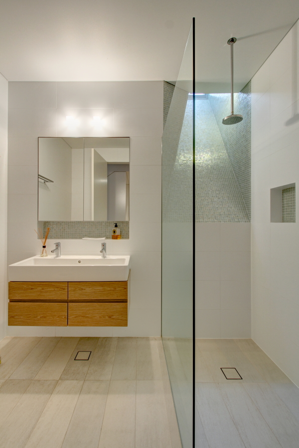
This bathroom sits into the hill but natural light and a view to sky is still available via the light shaft. The shaft tiles were chosen to refract the light.
-

The tiler refused, so we set-out the marble tiles on the bathroom floor so that the veins matched. It was a giant puzzle which had no picture to follow. It took 2.5 hours but it will forever look right.
-

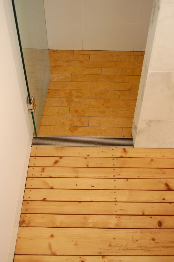
Cut timber boards allow water to pass through to a drip tray under the timber floor. The shower stone is cut in strips to match the floor boards - the colour and grain a close match. As a back -up, a stainless steel drain at the door collects drip and splashes from the door.
-

The light feature makes the journey to the garage something more than just a walk down the communal back stair / fire stair.
-

Items on the display shelf entertain the eye on the stair journey. Storage space is located behind the adjacent panels.
-

The white grille leads to the existing roof vents. It hides the low cost fluorescent lights above. Air conditioning comes through the grille in the veneer when the days just get too hot in the attic.